

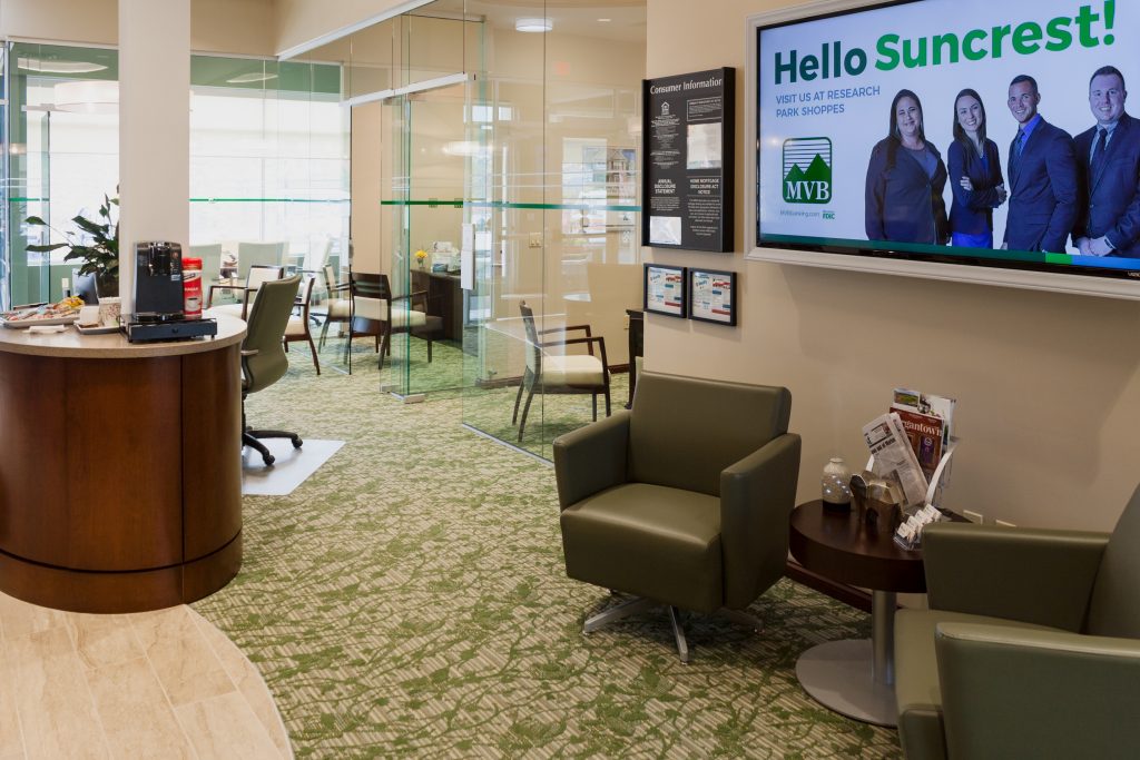
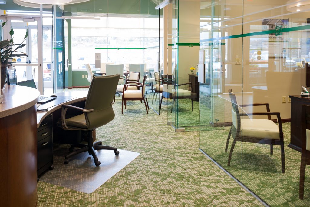
This well designed small space is invigorating. Natural light spills into this space from front to back leaving the environment filled with an airy feeling that welcomes everyone. All the glass keeps the natural light dispersed throughout. The light highlights all the thoughtfulness the designers have put into this space. It is evident that key design principles like unity, contrast, balance, rhythm and scale have been heavily considered to bring this small space together and make it so grand.
Unity
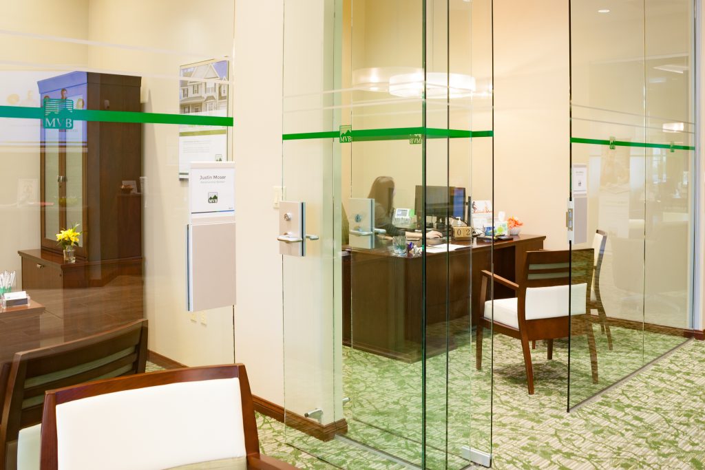
Glass unifies this space. When you walk into this space, you immediately feel like you are a part of something. No matter where others are, they can see you and you immediately see them. The sum of its parts makes the whole. Every element in this space seems to contribute to the function and beauty of this bank. It truly makes a statement for MVB and it’s brand.
Contrast
The rounded reception island in the center is obviously the focal point in this space. Its curves allow for the eye to follow all the way around the center. It’s the Yin-Yang contrast that then leads the eye, for example, the textured carpet and walls against the polished glass and floors. Lights play against darks easily in this space by incorporating the dark furniture elements with the light upholstery.
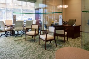 These reception chairs, with the thin cornered legs and the light upholstery, leave the area open but still invite waiting customers to sit. Peggy’s choice of furniture, National’s Escalade® Desk and Storage Components with Eloquence® Seating, complements the yin-yang. The added curves in the ceiling, lighting, flooring and furniture is intentional and works very well to soothe the corners of the small space. The bank exhibits an equal blend of traditional elements with contemporary protraying a feeling of stability while transitioning.
Balance
The whole environment revolves around its focal point, which is the center island that we just discussed. The floor-to-ceiling cornered column leads the eye from the curved tray ceiling down to the curved island and then to the curved transitions in the flooring.  There is a balance between curved furniture elements and cornered furniture elements. All the glass beautifully reflects the circular pendant lighting evenly dispersing more indirect light. The placement of the separate offices on the left and right side gives the space a symmetrical balance that offsets the radial balance achieved in the center.
Rhythm
Repitious patterns of round objects lend a hand to traffic. By design, the customer easily finds what they need. The use of greens in the walls, flooring, upholstery and décor is surely intended to motivate discussion about money as well as highlight the MVB brand. To assist with flow, the offices are rhythmatically placed around the island and each have the same glass front and all have the same furniture styles.
Scale
One gravitates toward the feeling that there must have been an exact science used to calculate sizes and proportions to all the elements in this space. Nothing appears out of place! The center island is a focal point, but not massive enough that you miss the rest of this beautiful space. The small offices are offset with the glass fronts. Glass allows the natural light to make the offices feel open and inviting.
This small space feels so grand. Unity, contrast, balance, rhythm and scale are principles designers left checked and they deserve a shout out for a job well done. Do you agree? If you need assistance or a design consultation, feel free to contact Peggy, Renee, Christina, Lauren or Cassidy at Omega Commercial Interiors.